Aude Van Ryne
Aude Van Ryne, born in Belgium, went to collage and studied a foundation at Brighton to then moved to London to do a BA in graphic design and then went on to do an MA in illustration at the Royal College of Art. She used drawing as a way of escaping and due to her parents arictucual background she knew what she wanted to do since she was 5.
Her work has diverse appeal providing her with opportunities for her work to be used on theatre poster, packaging, campaigns and in editorial illustration
Her understanding and intelligence of art and design is sensitive and focused. This is perfect for editorial illustration as sometimes hard hitting stories need a softer approach to warm the reader to the article.
Aude being a keen traveller has made a full sketch book based on the places she has traveled to. She has travelled to place like Namibia, Morocco, Mali, India, Central and South America and Lisbon. The inspirations from her travels have fed into her commercial work.
 |
| Figure 1 - Figure Art Work |
 |
| Figure 2 - Aude Van Ryn Artwork |
Her work suits well to editorial illustration as the lines, shapes are very neat, complete and simple. She likes using a range of silhouettes in blacked out shapes with bold colour that is simple and pleasing to the eye. I practiced her methodologies to create an image similar using the same shapes, line and tone that she does.
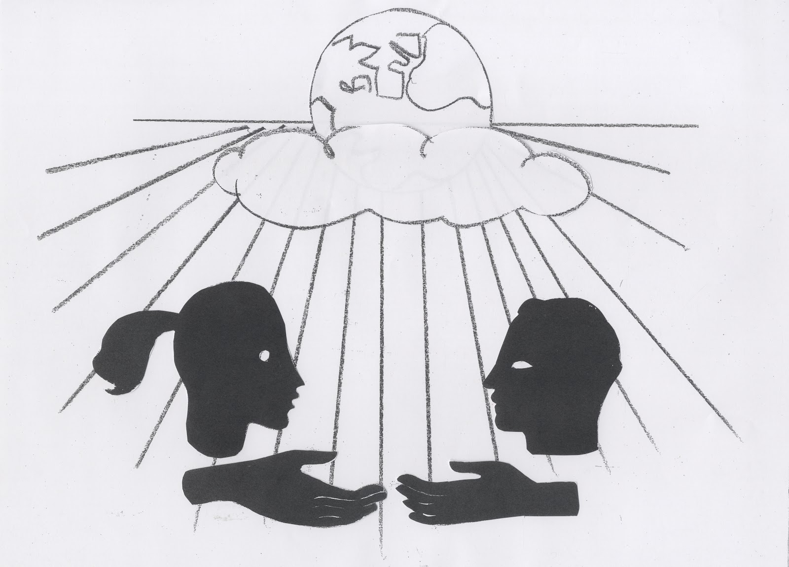 |
| Figure 3 - Using similar shapes to Aude Van Ryn to create an image |
 |
| Figure 4 - Scanned into Photoshop 2015 to add colour |
Within her work, Aude Van Ryn uses silhouettes and black out shapes within her compositions. A common feature of work of this time is to use these 'stage lines'. The way I have chosen to use them is as beams of light coming down onto the image. In the image above of Van Ryn's, the shapes around it are very simple and relatable. Within a workshop we were given simple shapes and basic elements that are used by Van Ryn. I chose the silhouette of a man and women reaching to touch hands. Their brains are connected and were created with a simple texture in photoshop. The image represents equality and uniting the world for harmony and peace. This breaks down a complex idea, or in Aude's case an article, and mades the images more simple and easy to read.
Image references
- Figure 1 - 2 - heart artist’s agents - artists - Aude Van Ryn - galleries - Aude Van Ryn 1
Bibliography
- Heart artist’s agents (no date) Available at: http://www.heartagency.com/artist/AudeVanRyn/biog (Accessed: 8 October).
- Heart artist’s agents - artists - Aude Van Ryn - galleries - Aude Van Ryn 1 (no date) Available at: http://www.heartagency.com/artist/AudeVanRyn/gallery/1
(Accessed: 8 October)
- Video Watched (2016) Available at: https://vimeo.com/50470763 (Accessed: 8 October).
No comments:
Post a Comment